
DESIGN PORTFOLIO
Brand Development.
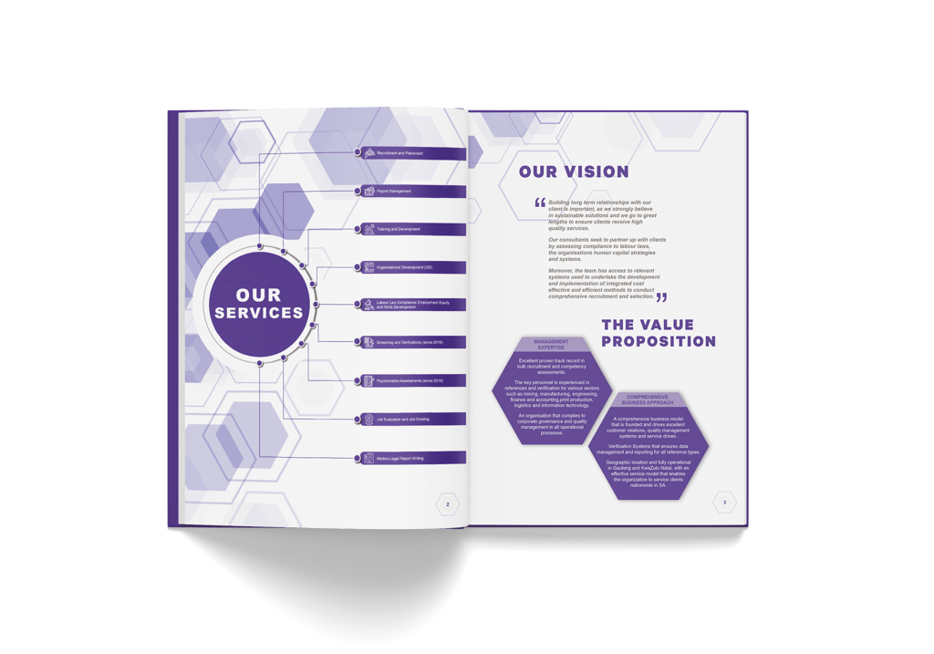
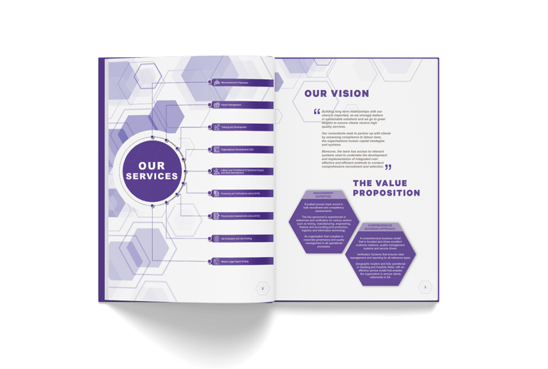
Description:
The Lookout, a vibrant entertainment company located in the heart of Cape Town. Specializing in curating immersive and unforgettable experiences, The Lookout sought to elevate its brand identity to better reflect its dynamic offerings and position in the entertainment industry.
Brand Essence and Values:
Core Identity: Defined The Lookout’s core brand essence as a catalyst for extraordinary experiences, emphasizing values such as innovation, excitement, and cultural engagement.
Mission and Vision: Articulated the brand’s mission to deliver unparalleled entertainment experiences and its vision to become the leading hub for diverse and creative events in Cape Town.
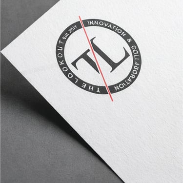
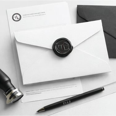
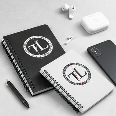
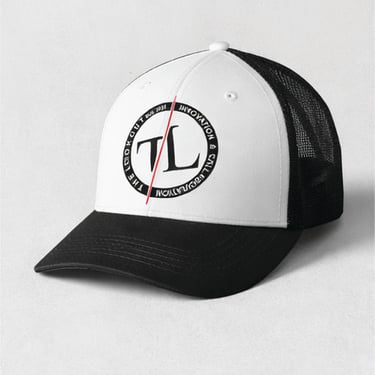
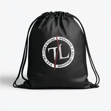
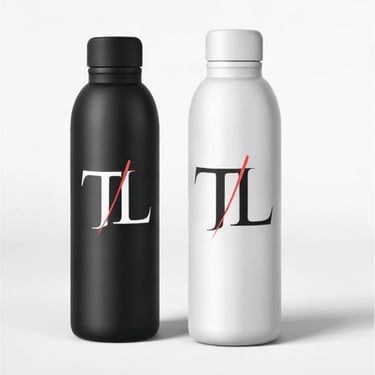
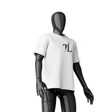
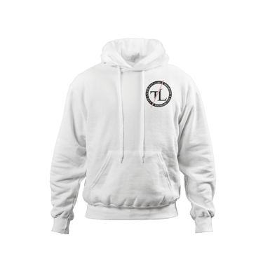
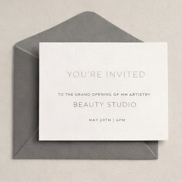
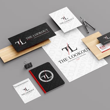
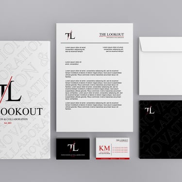
"The Lookout"
Description:
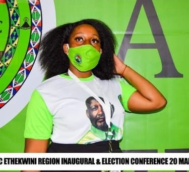
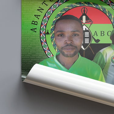
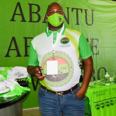
The branding process involved the creation of a new logo, visual system, color palette, and typographic style, designed to communicate strength, clarity, and connection to the people. The identity was grounded in Pan-African symbolism and visual cues that resonate with the party’s mission to uplift communities and represent the voice of the ordinary citizen.
In addition to the core identity, I developed a range of branded materials for campaign use, including event banners, apparel, posters, social media content, and print collateral. The brand system was created to be highly adaptable for use in both grassroots outreach and national-level political communication.
Key Deliverables:
Brand Identity Design (Logo, Typography, Color Palette)
Political Campaign Collateral (Posters, Flyers, T-Shirts)
Social Media Templates & Digital Graphics
Event & Rally Branding Materials
Visual Style Guide for Consistency
"Abantu Batho Congress"
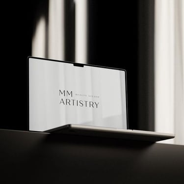
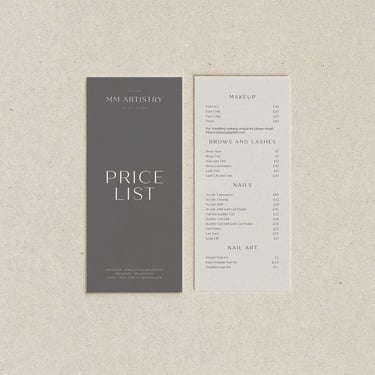
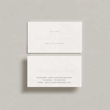
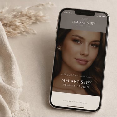
Description:
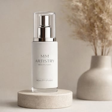
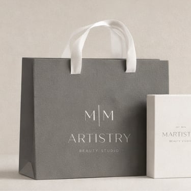
MM Artestry, a premier beauty studio dedicated to transforming individual beauty into an art form. Our objective was to elevate MM Artestry’s brand presence, ensuring it reflected the studio’s ethos of creativity, personalization, and excellence in beauty services.
Brand Identity Development:
Brand Essence and Values: Defined MM Artestry’s core values, focusing on creativity, empowerment, and artistry. This foundation shaped the brand’s unique identity and guided all subsequent strategic decisions.
Visual Identity: Crafted a cohesive visual identity, including a new logo, color palette, and typography. The design elements were inspired by modern elegance and artistic flair, aimed at conveying the studio’s dedication to bespoke beauty services.
"M|M ARTISTRY Beauty Studio"
Description:
The rebrand included the development of a new logo, color palette, typography system, and overall brand aesthetic, designed to communicate calm, confidence, and clinical expertise. I created a refined visual direction that blended clean minimalism with soft, organic elements—emphasizing the brand’s commitment to quality, innovation, and natural beauty.
Key brand collateral included product packaging concepts, print materials, digital templates, and social media content, all designed to deliver a consistent and luxurious brand experience across physical and digital platforms.
Key Deliverables:
Visual Identity Redesign
Brand Guidelines & Style Direction
Product Packaging & Label Design
Social Media & Digital Templates
Print & Marketing Collateral
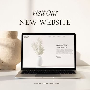
"JIVA Skin Clinic"
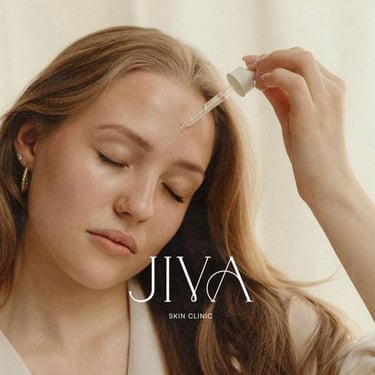
Description:
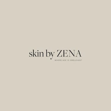
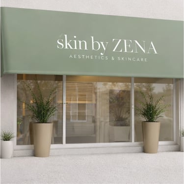
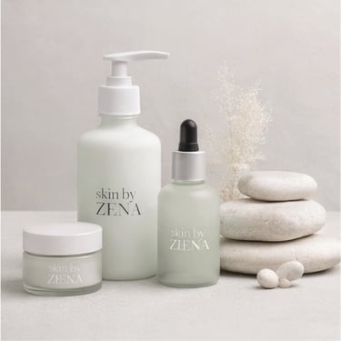
Skin by Zena Beauty Studio, a luxury beauty destination known for its personalized skincare treatments and innovative beauty solutions. This project aimed to redefine the brand’s identity, enhance its market positioning, and create a cohesive marketing plan to drive engagement and growth.
Brand Identity Development:
Brand Positioning: Established Skin by Zena’s positioning as a cutting-edge beauty studio specializing in customized skincare and advanced beauty treatments. The focus was on delivering a luxurious and transformative client experience.
Visual Identity: Redesigned the brand’s visual elements, including the logo, color scheme, and typography. The new identity reflects sophistication and modernity, with a serene palette inspired by natural skincare elements and elegance in beauty.
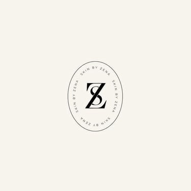
"skin by ZENA Beauty Studio"

Description:
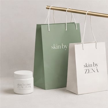
The project involved a complete overhaul of the brand’s identity, including logo redesign, color palette development, typography selection, and visual direction. I crafted a sophisticated brand system that balanced minimalism with rich, elegant detail—drawing inspiration from fine jewelry, classical design elements, and contemporary luxury aesthetics.
I also worked on developing brand collateral such as packaging mockups, social media templates, lookbook layouts, and digital assets, ensuring a seamless and luxurious brand experience across all touchpoints.
Key Deliverables:
Brand Identity Redesign
Visual Style Guide & Brand Toolkit
Packaging & Print Collateral Design
Digital Assets for Marketing & E-commerce
Social Media Visual Direction
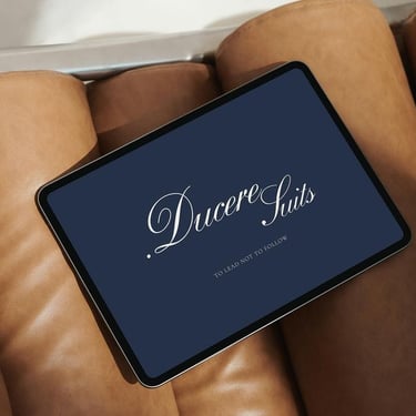
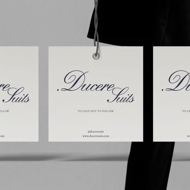
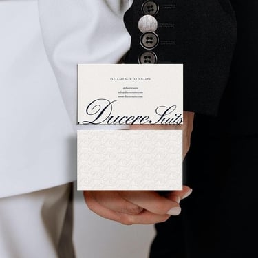
"Ducere Suits"
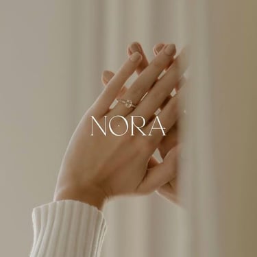
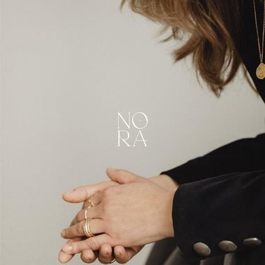
Description:
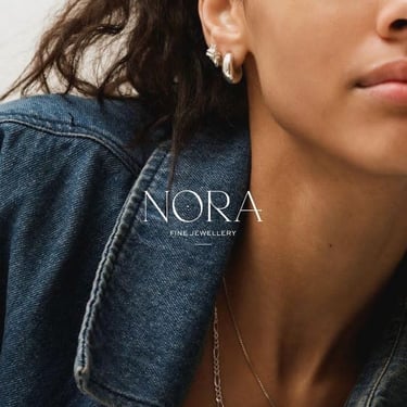
Nora, a distinguished jewelry brand renowned for its timeless elegance and craftsmanship. The rebranding project aimed to refresh the brand's identity while preserving its rich heritage, reflecting a balance between classic sophistication and contemporary flair.
Brand Identity:
Logo Redesign: We modernized the Nora logo to enhance its visual appeal, ensuring it resonates with today’s discerning clientele while maintaining a nod to its traditional roots.
Color Palette: A refined color palette was introduced, blending luxurious golds and deep jewel tones to evoke a sense of elegance and exclusivity.
Typography: Updated typography was chosen to complement the new logo and overall aesthetic, combining classic serifs with modern, clean lines for a sophisticated look.
"Nora | Fine Jewelry"
Brand & Marketing.
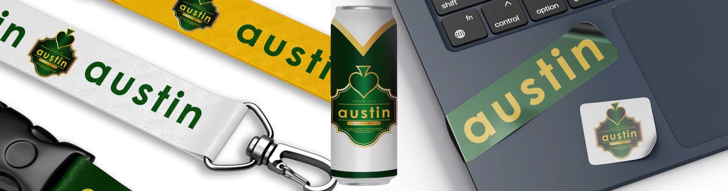
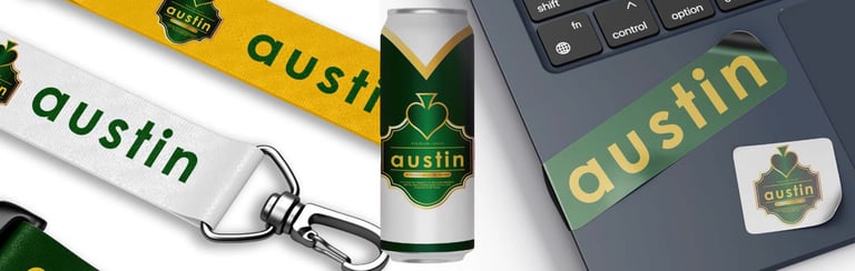
Description:
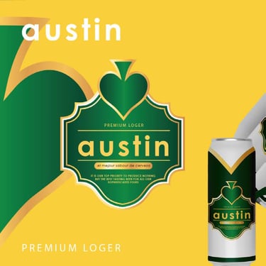
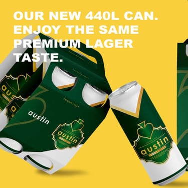
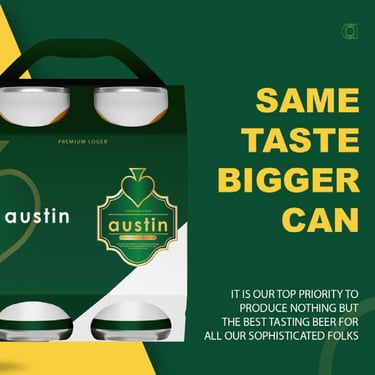
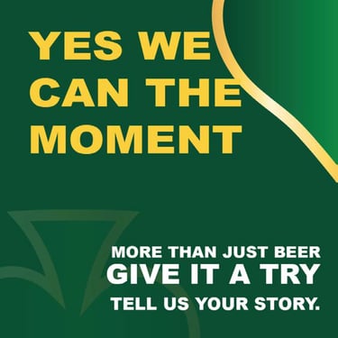
Austin Premium Lager is a premium beer brand concept developed to embody sophistication, quality, and timeless craftsmanship. The packaging design combines classic brewing traditions with a contemporary visual language, creating a product that stands out on the shelf while appealing to discerning beer enthusiasts. The rich green and gold colour palette reflects heritage, excellence, and premium quality, while the ornate label structure reinforces the brand’s refined character and attention to detail.
Design Highlights
Premium green and gold colour palette symbolising quality, prestige, and heritage.
Elegant label architecture inspired by traditional brewing emblems and classic European lager branding.
Strong typographic treatment that enhances brand recognition and shelf presence.
Modern packaging execution that balances heritage-inspired aesthetics with contemporary appeal.
Cohesive visual identity designed to create a memorable and premium consumer experience.
"Austin Premium Lager"
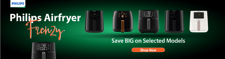
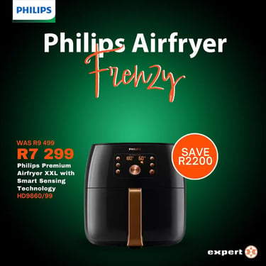
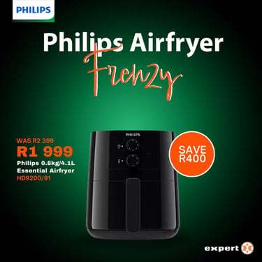
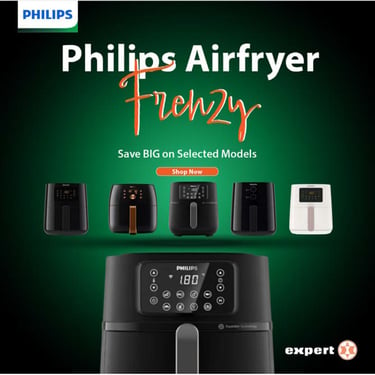
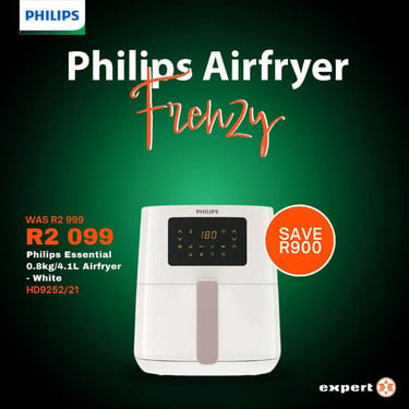
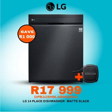
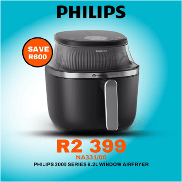
Description:
The design combines bold typography, strong product visibility, and a vibrant colour contrast to create an eye-catching visual that immediately captures attention in both digital and retail environments. By placing the product at the centre of the communication and emphasizing the value proposition, the campaign effectively balances brand credibility with commercial appeal.
Design Highlights
High-impact promotional campaign designed to drive retail engagement and sales.
Strong product-focused composition that showcases the Philips Premium Airfryer XXL as the hero element.
Strategic use of colour contrast to enhance visibility and create urgency around the promotional offer.
Clear information hierarchy communicating pricing, savings, and product features effectively.
Premium visual treatment aligned with Philips' reputation for innovation, quality, and consumer trust.
"Philips Airfryer Frenzy – Retail Campaign Design"
Description:
Dial-A-Mula is an innovative financial services and empowerment brand focused on providing accessible, affordable, and life-changing financial solutions to individuals and families. The brand is committed to helping communities secure their future through practical financial products, including funeral cover, medical benefits, insurance solutions, and wealth-building opportunities.
Brand Values
Accessibility – Making financial services easy to understand and available to all.
Empowerment – Equipping people with opportunities to improve their financial well-being.
Trust – Building long-term relationships through transparency and reliability.
Affordability – Delivering value-driven solutions tailored to everyday needs.
Community Growth – Supporting individuals and families in creating sustainable futures.
"Dial-A-Mula – Brand Campaign"


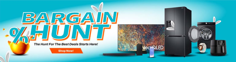
Description:
Expert is a trusted retail brand dedicated to delivering exceptional value, quality products, and unbeatable deals to consumers. With a strong focus on affordability and customer satisfaction, the brand creates shopping experiences that make premium products more accessible to everyday households.
Brand Values
Value for Money – Delivering exceptional deals without compromising quality.
Customer Focus – Creating promotions and experiences that benefit shoppers.
Trust & Reliability – Building confidence through dependable products and service.
Accessibility – Making quality products affordable and attainable.
Innovation – Using creative marketing and retail solutions to engage customers.
"Expert – Bargain Hunt Campaign"


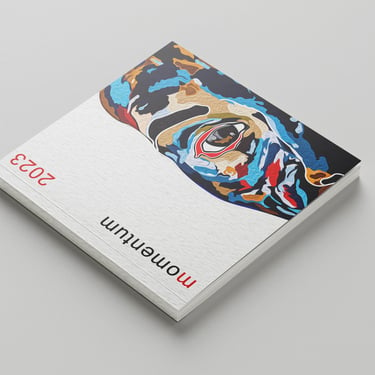
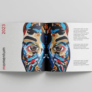
Layout Design.
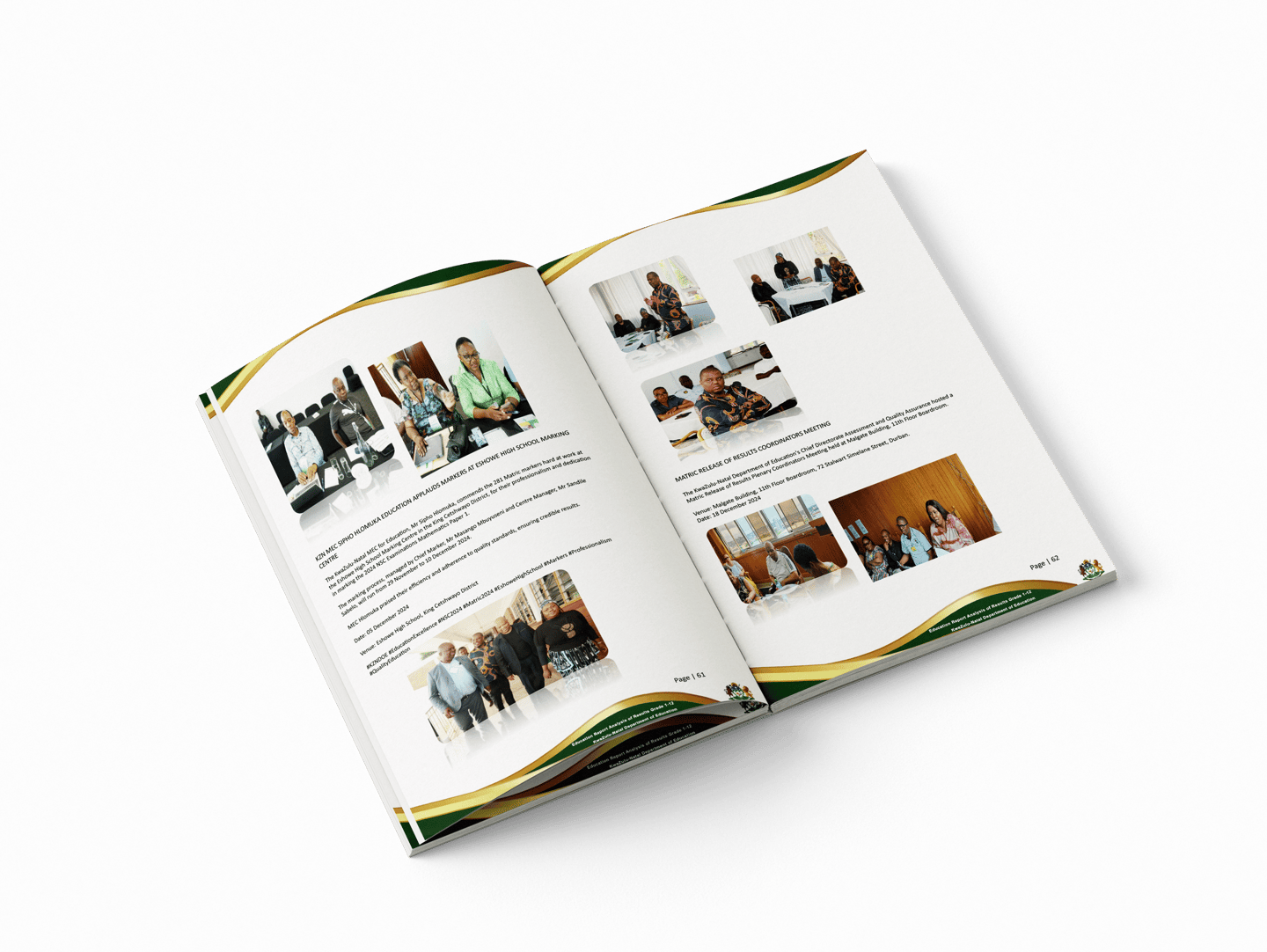
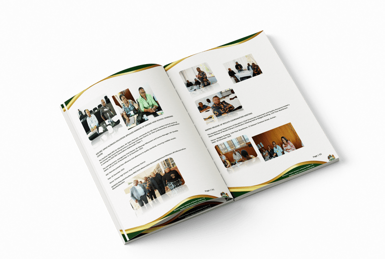
SA Department of Education Annual Performance Report
The design approach focused on clarity, accessibility, and professionalism, while incorporating visual elements that reflect the spirit of South African education and public service. I developed a cohesive visual layout that balanced informative content with engaging design—using a clean typographic hierarchy, structured grids, infographics, and curated imagery to make the information digestible and visually appealing.
Key Skills Used:
Publication Layout & Editorial Design
Typography & Infographic Design
Branding Compliance
Print Production Management
Stakeholder Communication & Collaboration


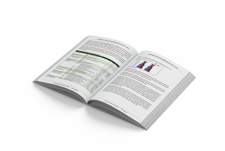
SA Department of Education Results Report Book
A clean, professional layout that balanced detailed statistical data with strong visual elements, including infographics, graphs, and charts, to make complex information easy to interpret. The visual language was aligned with government brand guidelines, while still allowing space for engaging design and thoughtful composition.
Key Skills Used:
Editorial & Data-Driven Design
Infographic & Chart Design
Typography & Layout Systems
Government Brand Compliance
Print & Digital Publishing
Risen Co. Company Profile
The design approach combined clean editorial layout with soft, earthy tones and imagery that evoked the warmth and craft of homegrown baking. I incorporated the brand’s identity throughout the profile—using thoughtful typography, custom icons, and product photography to tell the story of Risen Co. in a way that felt authentic and appetizing.
Key Skills Used:
Brand-Driven Editorial & Layout Design
Visual Storytelling for Food & Lifestyle Brands
Typography & Colour Theory
Content Structuring & Messaging
Print & Digital Publishing
Packaging Design.
Description:
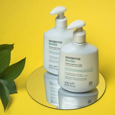
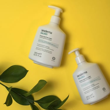
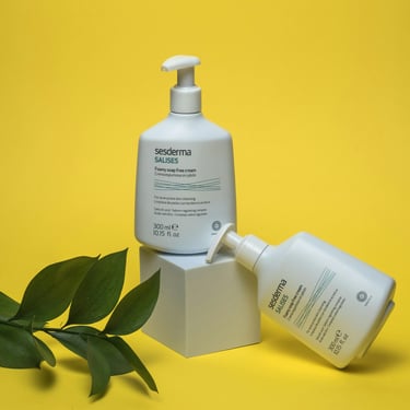
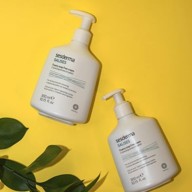
Two product bottles are artfully arranged on a circular mirror, creating clean, symmetrical reflections that emphasize the product's premium packaging from multiple angles. The clinical, clean white design of the bottles is balanced and softened by the inclusion of organic, deep green foliage framing the left side of the composition, bridging the gap between scientific formulation and natural harmony.
Brand Essence & Value
Brand Essence: Dermatological Innovation meets Everyday Clarity.
Brand Value: The visual narrative highlights Sesderma's commitment to clinical efficacy and advanced nanotechnology (as indicated by the "Nanotech" emblem on the packaging). The bright, clinical yet approachable setting conveys honesty, targeted care for acne-prone skin, and the refreshing confidence that comes with healthy, dermatologist-backed skincare solutions.
"Salises Foamy Soap-Free Cream (300 ml / 10.15 fl. oz)"
Description:
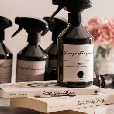
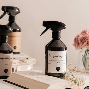
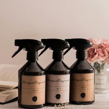
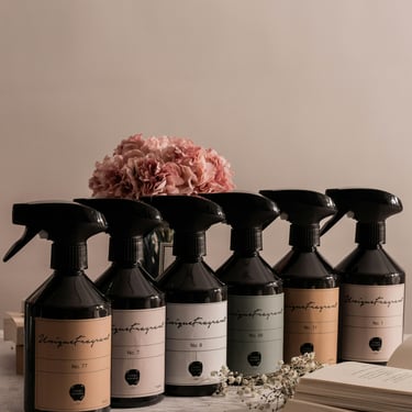
The hero product, "No. 8," is positioned prominently in the foreground, elevated on a curated stack of contemporary poetry books by Michael Faudet (Bitter Sweet Love and Dirty Pretty Things). This deliberate pairing creates a strong thematic connection between evocative scent profiles and emotional storytelling. The background features a soft-focus depth of field, showcasing a sequential lineup of the brand's alternative fragrance numbers alongside delicate pink florals, establishing a cohesive and sophisticated product ecosystem.
Brand Essence & Value
Brand Essence: Scented Narratives for the Modern Space.
Brand Value: UniqueFragrant values the intersection of artisanal home wellness and literary elegance. The use of dark amber apothecary bottles paired with a minimalist, clean white label reflects a commitment to timeless, sustainable design and intellectual luxury. The overall imagery communicates that fragrance is not just an ambient addition to a room, but a deeply personal, poetic experience that defines the home.
"UniqueFragrant (featuring "No. 8" as the hero product)"
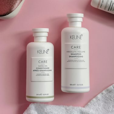
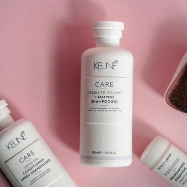
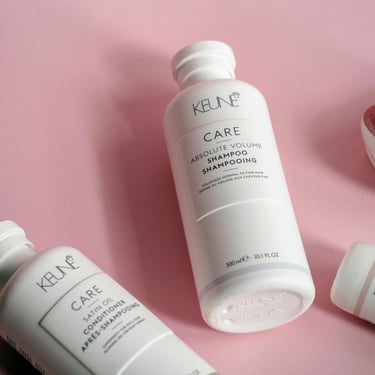
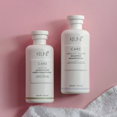
Description:
The hero product—the Absolute Volume Shampoo—is positioned vertically in the center, acting as the anchor for the visual layout. Surrounding it are supporting products from the Keune Care family arranged at dynamic, contrasting angles, including a sleek, glitter-backed detangling brush that adds a touch of texture and sparkle. Soft, directional studio lighting casts gentle shadows to the left of each object, giving the flat-lay a beautiful sense of depth, weight, and premium quality.
Brand Essence and Values:
Brand Essence: Scientific Hair Care with a Touch of Everyday Luxury.
Brand Value: Keune represents professional-grade innovation, tailored solutions for specific hair needs (from volumizing to smoothing), and elegant minimalism. The clean, apothecary-inspired white bottles juxtaposed against the playful pink background highlight the brand's core balance: serious, high-performance hair science delivered through an approachable, aesthetically pleasing self-care ritual.
"Keune Care Absolute Volume Shampoo"
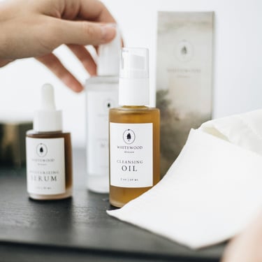
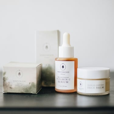
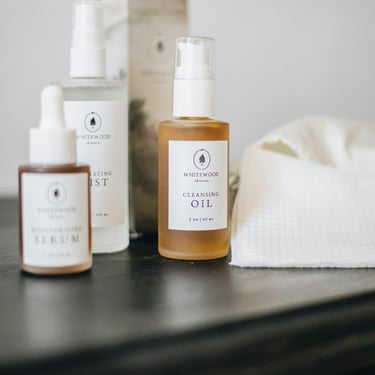
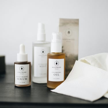
Description:
The packaging design features muted, watercolor-inspired green and earth-toned landscapes with an elegant pine tree emblem, which is visually echoed across the product labels. The soft, diffuse natural lighting captures the translucent quality of the formulations and the frosted textures of the containers, delivering an organic yet polished presentation.
Brand Essence and Values:
Brand Essence: Nourished by Nature, Grounded in Simplicity.
Brand Value: WHITEWOOD skincare embodies holistic skin health, clean formulations, and environmental mindfulness. The understated elegance of the typography combined with the soft, fine-art landscape illustrations on the packaging communicates a deep connection to the natural world.
"WHITEWOOD Artisanal Skincare"
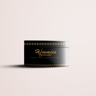
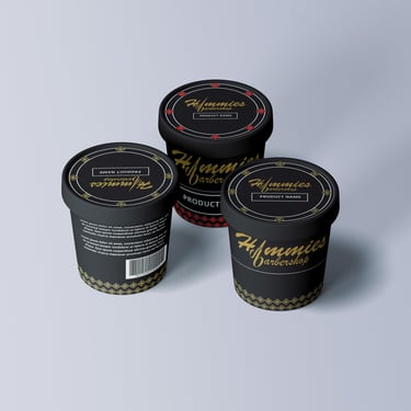
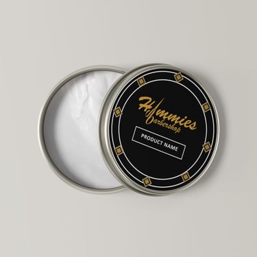
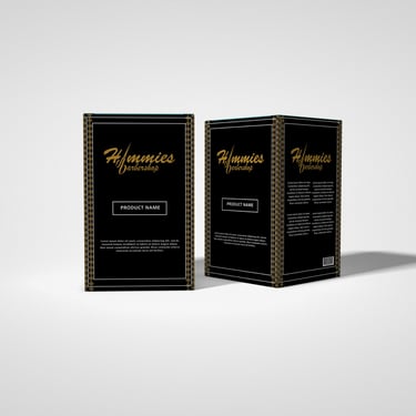
Description:
The center of the jar features the stylized script typography logo for "Hommies Barbershop," integrated with a sleek hair clipper blade graphic that underscores the brand's industry heritage. Framed along the top lid and bottom base are intricate, geometric diamond-patterned borders that add a refined, luxury-tier touch to the packaging.
Brand Essence and Values:
Brand Essence: Classic Heritage Meets Contemporary Sharpness.
Brand Value: Hommies Barbershop embodies the timeless tradition of male grooming while catering to modern stylistic standards. By pairing a bold, masculine black aesthetic with elegant gold detailing, the product conveys premium quality, precision craftsmanship, and upscale confidence.
"Hommies Barbershop Premium Hair Pomade"
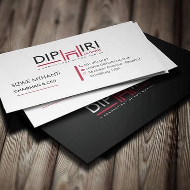
Logo Design.


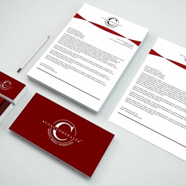
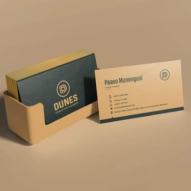
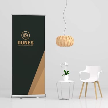
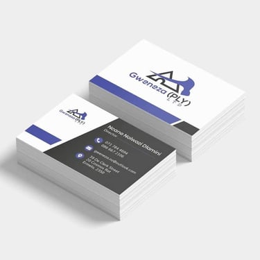
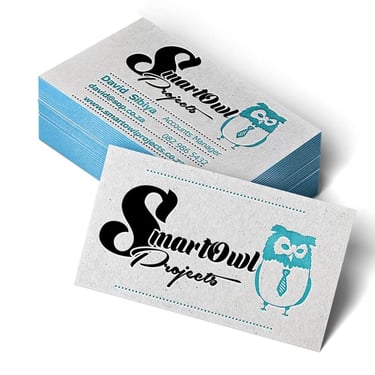
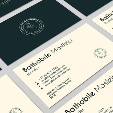
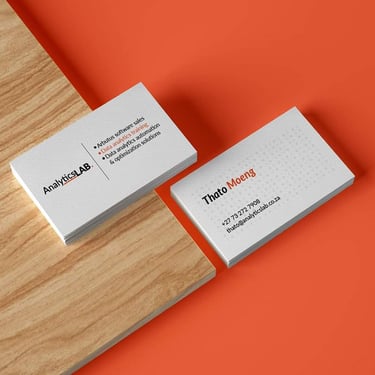
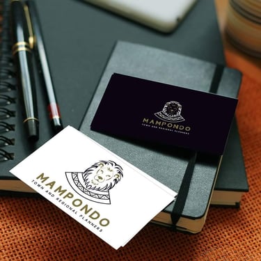
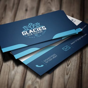
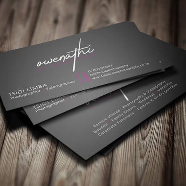
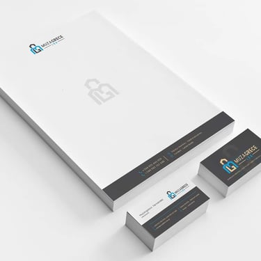
Stationery.
Poster Design.


Website Design.
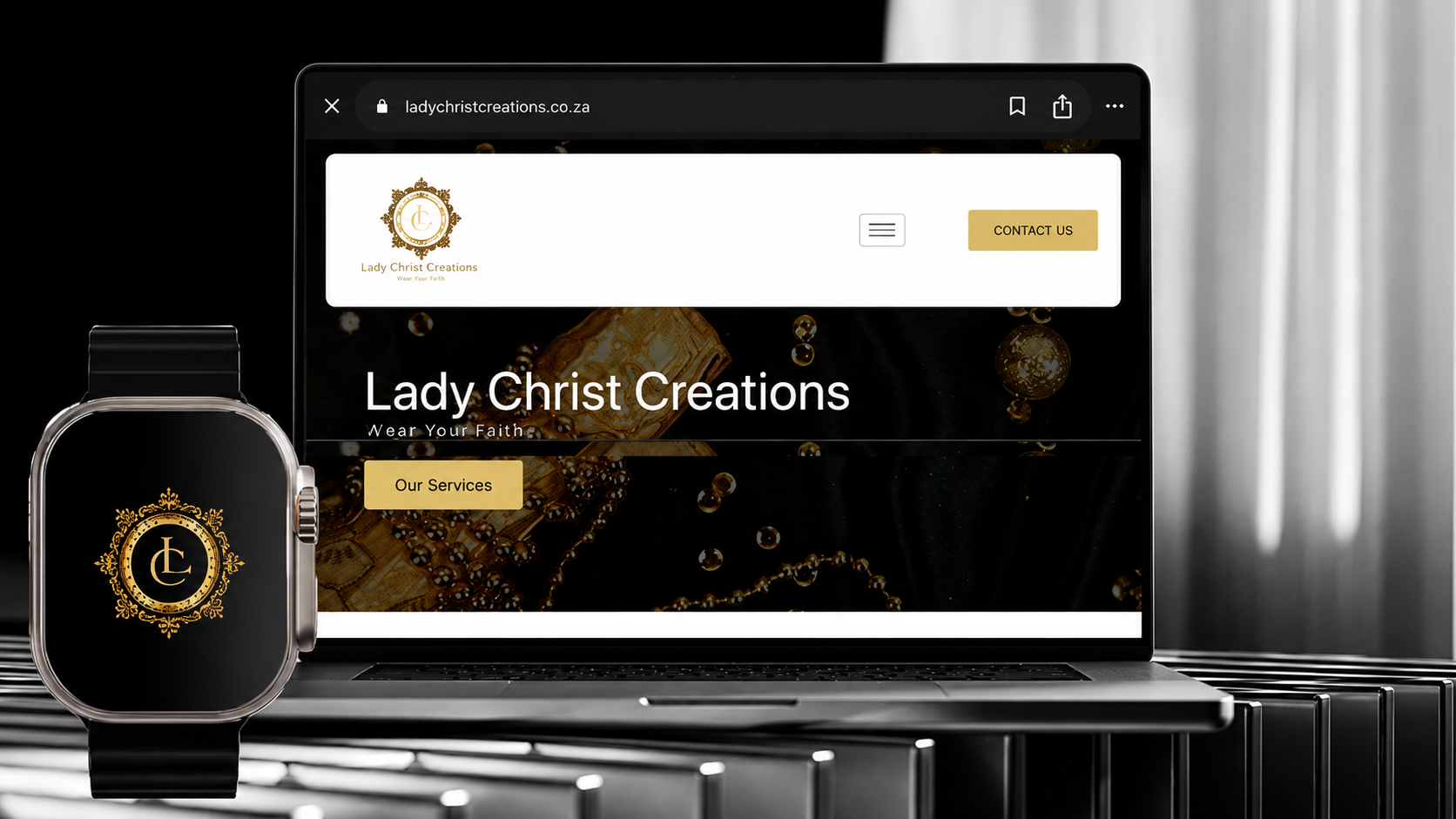
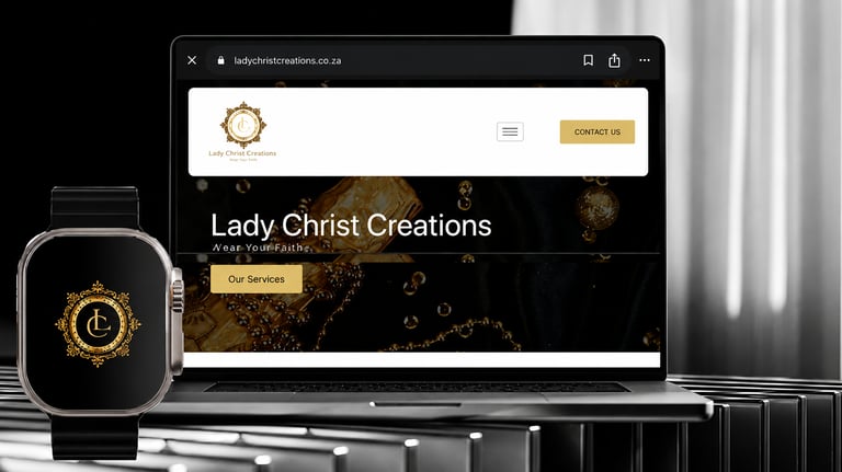
Description:
The desktop website layout features a clean, high-contrast navigation header that effortlessly balances minimalist modernism with intricate branding. Below the header, a rich, dark background showcases abstract luxury imagery—such as glistening gold beads and textures—which serves to ground the bold typography of the brand name and the gold-blocked call-to-action buttons ("Our Services," "Contact Us"). Additionally, the visual ecosystem is extended to a smartwatch interface mockup, demonstrating the adaptability, versatility, and scalability of the brand’s ornate circular crest logo across various digital screens.
Brand Essence and Values:
Brand Essence: Elegant Devotion and Intimate Expression.
Brand Value: Lady Christ Creations merges modern sophistication with deep-rooted personal beliefs, allowing customers to proudly "Wear Your Faith." The use of regal, golden filigree detailing in the logo alongside a sleek, dark-mode user interface communicates a sense of high quality, timeless value, and spiritual pride. The overall brand presence positions faith-focused accessories or apparel not just as casual items, but as premium statements of purpose, identity, and graceful living.
"Lady Christ Creations"
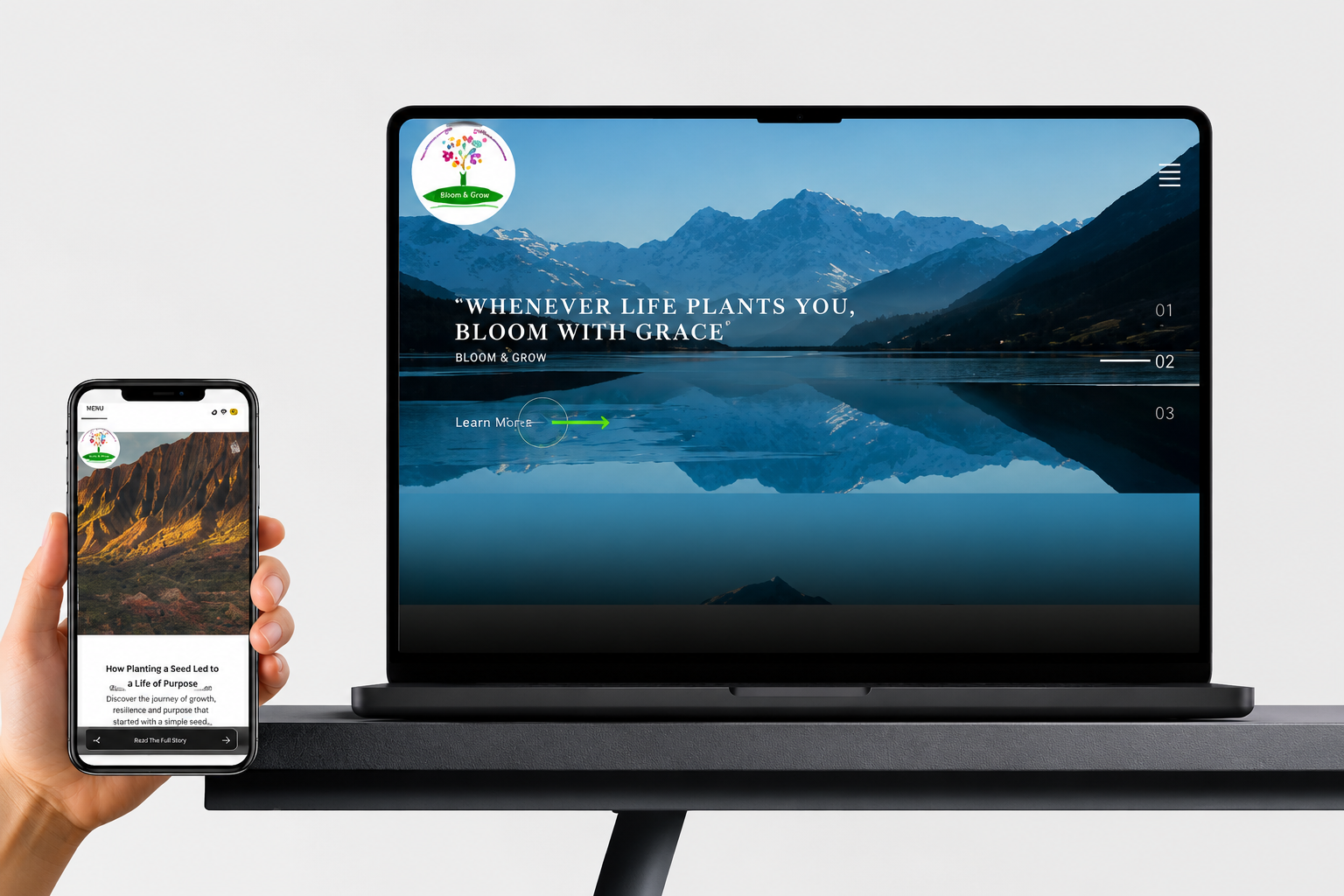
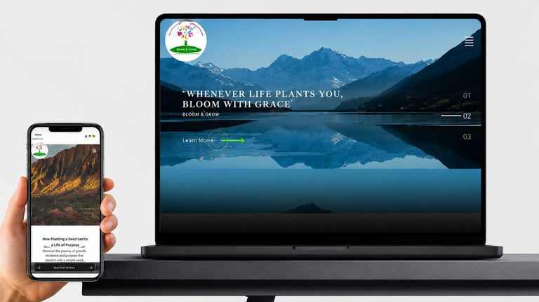
Description:
The desktop interface introduces users to a serene, blue-toned mountain landscape mirrored perfectly across a still lake. Clean, white serif typography anchors the brand's core statement, paired with minimal navigation elements, numbered section indicators (01, 02, 03), and a vibrant green "Learn More" interactive arrow.
Brand Essence and Values:
Brand Essence: Nurturing Personal Evolution and Resilient Graciousness.
Brand Value: Bloom & Grow values resilience, mindfulness, and the beauty of personal journeying through life's hardships. By pairing majestic, expansive natural landscapes with encouraging, purpose-driven copywriting, the digital presence communicates a safe space for personal development, wellness, or community growth. The overall aesthetic balances professional, clean web layout practices with an uplifting, warm, and highly approachable human message.
"Bloom & Grow Responsive Web Design"
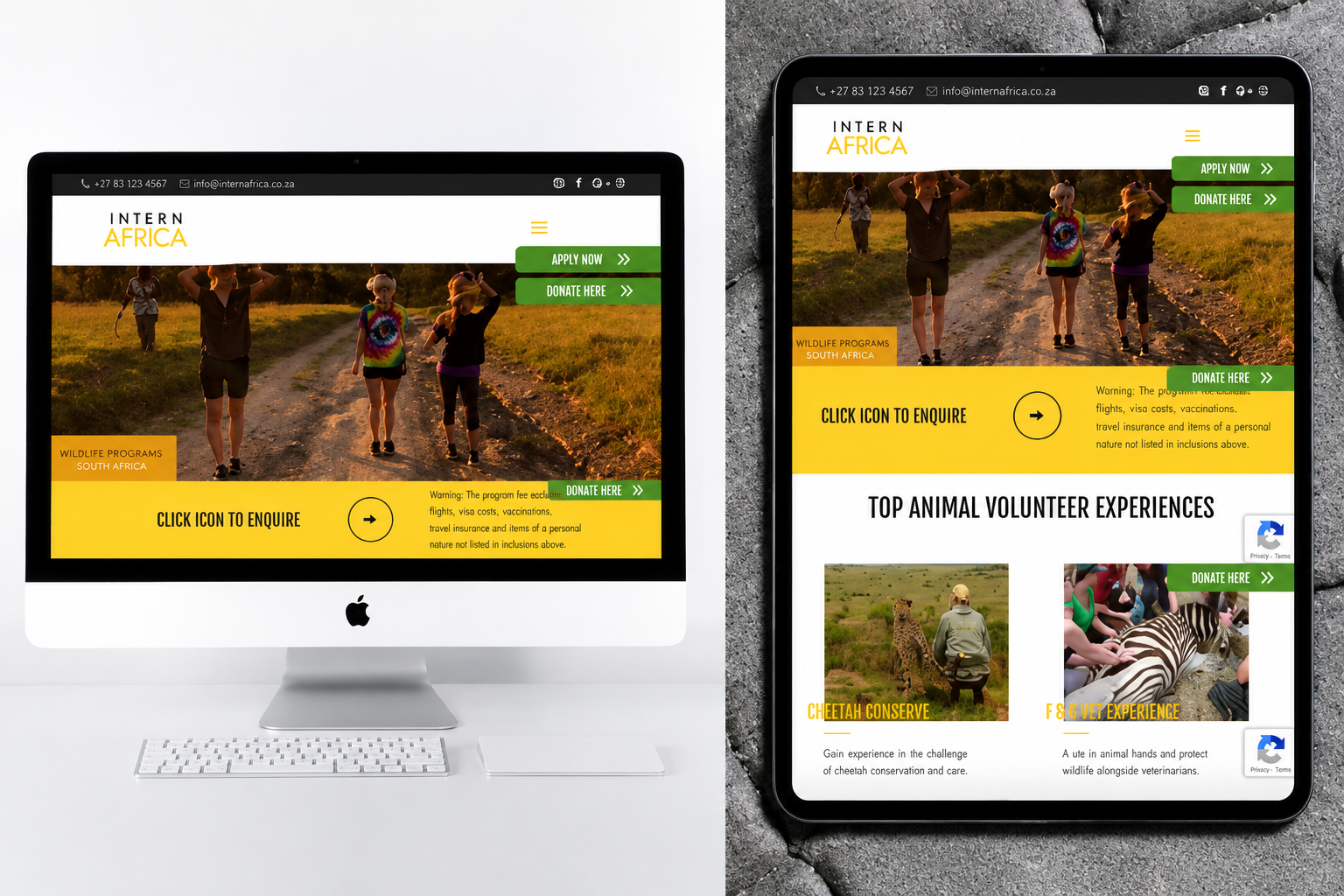
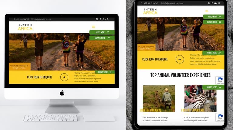
Description:
A bright yellow interaction block guides the user journey with an intuitive "Click Icon to Enquire" prompt. On the tablet layout, the interface transitions smoothly into a structured grid showcasing specific program tracks, utilizing card components to separate "Cheetah Conserve" and "F & G Vet Experience" programs with clean typography, clear imagery, and consistent donation access points.
Brand Essence and Values:
Brand Essence: Purposeful Adventure and Active Conservation.
Brand Value: Intern Africa embodies a commitment to wildlife preservation, community contribution, and experiential education. The energetic use of earthy greens and vibrant yellows evokes the warmth and raw beauty of South Africa's natural heritage, shifting the digital experience from a standard agency to an invitation for change. The design prioritizes transparent, accessible navigation to highlight the brand's core mission: connecting passionate individuals with ethical, hands-on conservation work that truly makes an impact.
"Intern Africa Web Design & Impact-Driven Branding"
m.mavundla@nouveaucompany.com
+27 81 630 7523
CONTACT:

Copyright © 2024 Nouveau (PTY)Ltd. | Nouveaucompany.com . All rights reserved